I’ve got something to admit. I’m biased when it comes to visual inspiration in learning, because I want learning to be screen lickin’, good lookin’, hot sauce. The Chameleon team like pretty learning so much, we built a digital platform just to make learning more beautiful.
But it’s not (just) that we’re design snobs. Turns out we’re onto something with this visual learning obsession of ours. Making learning content visually inspiring helps people learn.
Three reasons why images help people learn
1. Images help us process info faster
People respond to visual info faster than text. While there’s no proof to the widely made claim that we process visuals 60,000 times faster than text, researchers at MIT found we process images in only 13 milliseconds, which means we can recognise more than 4,500 images in a minute. Even speed readers can only manage approx. 700 words a minute, and most of us read around 200-300 words in that time.
We’re not entirely sure why we process images faster than text. One theory is that when we read text, our brains carry out a long, complex process to extract meaning. Whereas we’ve evolved to process visual info almost instantaneously as a survival mechanism.
2. Images improve our ability to remember info
Humans remember images better than words. The theory is images automatically trigger associations with other knowledge, inscribing our memory of images deeper than our memory of words. Neuroimaging experiments indicate words and images are processed by different areas of our brain in different ways, but our understanding of this is rudimentary.
We may not know why, but there’s no doubt including images improves retention. One study showed combining text with graphics improved students’ performance in a test by a median of 89%. Students got less than 40% of their answers correct after reading text alone. Their correct answers improved to 65% when graphics were combined with words.
There’s also proof that combining images with text improves our ability to remember things long-term. After three days, a user retained only 10-20% of written or spoken information but almost 65% of visual information.
3. Images help us communicate more effectively
The concept of visual, auditory, and kinaesthetic learners has been roundly debunked. In reality, we’re all visual learners. After all we all process visual info faster than words, and we all retain info better if it includes images.
But evidence shows visual communication is important. Research by psychologist Albert Mehrabian indicated that 93% of communication is nonverbal. People rely 55% on facial and physical cues, 38% on vocal intonations, and only 7% on the actual words said. What this means for e-learning is images that show emotion will communicate more than words alone.
Use images to simplify complex ideas
The other big bonus of imagery is it helps us present complex ideas in a digestible way because people process images faster and retain them longer.
One beauty of imagery is the ease with which it enables us to show different angles of an idea.
- You can present the big picture.
- You can zoom in and show important details.
- You can show different states at once, e.g., past, present and future.
- You can show how ideas interconnect and overlap.
- You can visually represent processes.
So, use images to give an overview of an idea, then unpack the details in your text, if required.
Ways to incorporate visual inspiration into learning
There are four ways to include visual inspiration in your learning.
- Photography
- Illustration
- Infographics
- Video
Chameleon supports all four mediums, but the two modes we see used most often are photography and illustration. I worked with learning designers Inspire Group for nine years before we launched Chameleon. And as part of the discovery process with our clients we’d discuss whether their brand sat stylistically in the photography or illustration camp, or whether we could use both modes of visual communication in their learning.
Both photography and illustration have their place in learning, so we thought it might be handy to do you a quick run down of the pros and cons of both mediums.
Photography vs illustration
Photography can be challenging for L&D teams, as they tend to tackle a huge variety of subjects with tight timeframes and budgets. Those limitations can become difficult when it comes to photography. If you’ve a large budget for top photographers, videographer, and postproduction, you can do anything with video and photography. The level of talent and execution is amazing. But learning designers often favour illustration over photography because it’s more affordable, flexible, and accessible. It has other benefits too.
| Photography | Illustration |
| Great for depicting real products, places and people, real life scenarios, and serious topics. | You're not hamstrung by reality when it comes to describing a subject visually. |
| Requires precision and very careful briefing to achieve the exact results you need. We have high standards for realism with photography. | Gives you more leeway to be abstract with your representation. |
| Requires time to book a photographer, arrange location, talent and props. | Create visual content rapidly. |
| The look of photography comes down to the style and skills of a photographer and is a creative negotiation. You only have one shot to get it right. | Get exactly the look, content, and angle you need. Pivot quickly if something isn’t right. Sought after illustrators are artists in their own right and working with them is a creative negotiation. |
| Lighting, styling and a creative eye can make even mundane subjects spectacular. But it’s hard to transcend some limitations without a large post-production budget. | Elevate vanilla subject matter with creative style and imagination. There are no limits to your creative license. |
| While photographic styles are broad it’s hard to customise photography to your brand without a longstanding collab with a skilled photographer. | Adjust your style easily to fit your brand or your subject. Illustration can be whimsical, playful, elegant, realistic, or serious. |
| Achieve photo-realistic reproductions. | Achieve amazing detail. Scientific illustrations allow you to show even more detail than real life. |
| Full control and flexibility is hard to achieve with photos, for example you can’t transcend certain limitations or add info that isn’t there. | Control the complexity of the info you present. An infographic can be very simple, or you can add more layers. |
Ten benefits of illustration
I'm passionate about illustration because you can use it to step into the world of the imagination. It’s easier to push concepts further than you can with more realistic mediums like video and photography. But creative freedom isn’t the only benefit of illustration. Not by a long way. In fact, when it came to listing reasons to love illustration, it was tough to keep it to ten.
- Reflect your brand look, feel, and values in your imagery. Illustration can span styles from naïve and fanciful to realistic and refined.
- Complete control and versatility to shape imagery to your learning needs. Provide context and assist your narrative with visuals that represent the situation you’re describing or use visual metaphor.
- Customize imagery to suit your needs easily, efficiently, and cost effectively. This addresses the common L&D challenges of limited time and budget.
- Adapt images to reflect diversity quickly and easily. Illustration’s abstract quality also helps eliminate unconscious bias.
- Create emotional connection. Illustration conveys emotion in ways text cannot, and photography struggles to capture without exceptional photographers and talent.
- Convey a large amount of info and reduce the amount of text you need without compromising on the quality of the info you’re sharing.
- Control the complexity of the info you convey. An infographic can be very simple, or you can add layers of detail. Zoom in or zoom out for the micro or macro view.
- Serve up learning in the tasty nuggets our brains prefer. Creating learning material with plenty of visual inspiration creates natural pauses, shifts the mode in which we’re consuming content, and makes learning easier to digest.
- Encourage creative engagement and thought. We bring our imagination to the process of engaging with illustration in a way we don’t with more realistic imagery.
- Push concepts further. The only limit is your imagination. Animate illustration for another layer of visual excitement.
Best practice when creating illustrations for learning
I sat down with kick arse illustrator and Chameleon design lead Gwilym Devey to talk about best practice when it comes to creating illustrations for learning.
Build your illustration brand
Invest in developing your illustrative brand style. Create an illustration framework for your brand to set your illustrators and designers up for success, and a library of illustrated brand assets so you can adapt and scale illustrations fast.
Illustrative trends come and go. Right now, 3D illustration is trendy. The grungy vibe of the early noughties is coming back. Don’t jump on the latest trend and end up looking like everyone else. Make sure your illustration has longevity by reflecting your brand look, feel, and values first.
Go with bespoke illustration
Steer away from stock photography and illustration whenever you can. They’re generic and vanilla, it’s hard to find what you need, you can’t own stock images for your brand because others can use them too. You’re watering down the quality of your learning.
Sometimes stock imagery can feel like your only option if you’ve a small budget, a tight deadline, and no internal resource to create illustration. But think big picture, establish a relationship with a skilled illustrator and invest in building a library of bespoke illustrations.
If stock is your only option, use quality illustration libraries.
- Undraw. Free open-source illustrations that are easy to customise to your brand style.
- Blush is a great library, with illustrations from artists across the world.
- Chameleon has an image library, and over the next year, we’ll be investing in arming you with a much bigger range of illustrative assets and styles.
There are more tools to help you create visual learning content here.
How to get the best out of illustrators
When you’re briefing your illustrator, consider the scope of your project, the ideas you want to present and the scenarios you want to show, and curate a list of the images you think you need. With digital learning it can be really helpful to storyboard your modules. Chameleon makes it easy to dive in and build out your learning interactions without illustrations.
This is the time to get your illustrator in to take a first look at your storyboard and your draft list of images. Illustrators are skilled visual communicators, so they’ll be able to help you refine the brief and add their own valuable suggestions to the mix.
Once your module's starting to take shape, and you’ve achieved your learning outcomes, you can test your storyboard with stakeholders. You might develop a few examples of illustrations for this phase so your stakeholders know what the learning will look like.
Hold off building out the full suite of images until you’ve got agreement on your content and the illustrations you need. Once that happens, it’s time to give your illustrator the final brief.
You may be working with stakeholders who struggle to imagine illustrations. They’ll say things like, “I’m very visual, so I really need to see it first before I can sign it off”. If this is the case digital illustration is your friend because it’s so versatile and easy to change that you can create draft illustrations pretty quickly and evolve them based on feedback.
Beautiful illustration in learning
Here are some examples of beautiful illustrations in learning that we love!
- Seek monster for normalising mental wellbeing days.

- NBN isometric map showing their different communication technologies.
Make your learning more visual with Chameleon
The sad truth is many e-learning platforms are “PowerPoint on steroids”. Not our words. That’s what our clients say about the platforms they used before they switched to Chameleon. But with the right tool, learning can be as visually beautiful, as the content is useful. And by improving your learner’s experience by making learning more attractive, you increase the chances of your learning creating the change in attitude and behaviour you desire.
We’ve three core design principles. Is it easy? Is it efficient? Is it beautiful? An exceptional visual experience is at the heart of Chameleon learning. Our other key principle is we don’t look inwards or backwards. We focus outwards and forwards, looking outside the learning industry at what the top players in digital are doing with design. We're constantly dancing between what's proven to work and innovating to make your learning more effective.
If you’d like to make your learning more visually engaging and more effective, view our demo, and see how Chameleon makes beautiful learning easy to achieve.
What to read next:
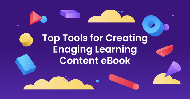
Need a bit of help creating visually amazing looking learning content? Check our ebook:
Top tools for creating highly visual digital learning content.
Want to learn more about Chameleon Creator? View a demo
In our 10 minute recorded demo, we'll show you how to build and publish your own module.

.png?width=318&height=424&name=MicrosoftTeams-image%20(26).png)
Share this

Measuring the impact of learning

Should you include your brand in learning content?
.png)